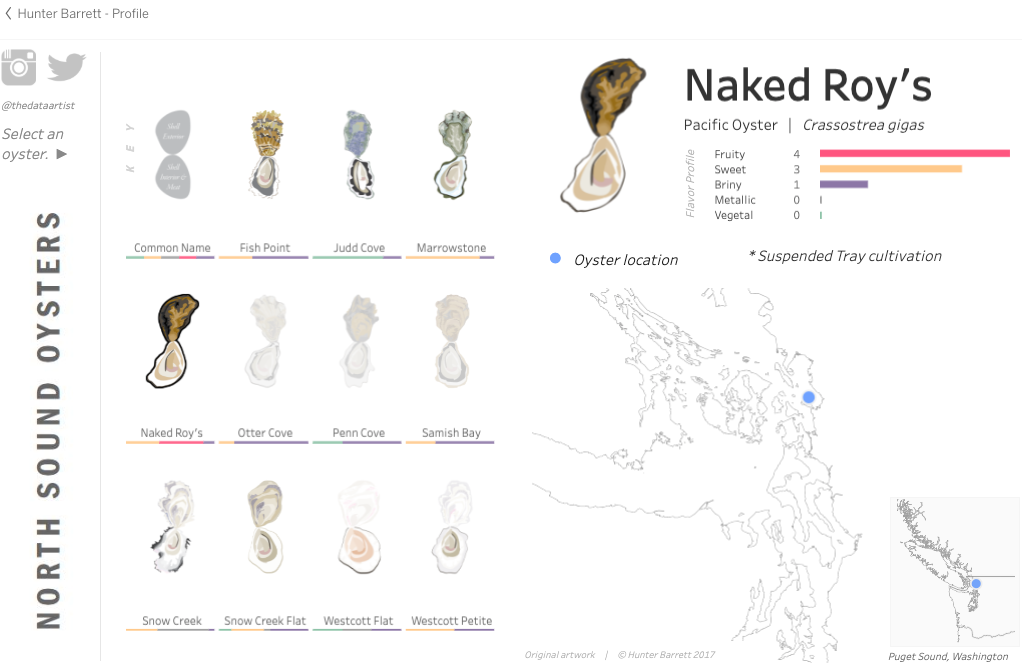
We’re on the lookout for fun examples of oyster-related data visualizations, kind of like our own Oceans of Oysters World Map. Today, we came across a clever lil’ art project (credit: Hunter Barrett), and just wanted to give it some love! For some North Puget Sound oysters, it offers a flavor profile with scales for fruity, sweet, briny, metallic and vegetal. You could compare that with Oysterater community ratings on Penn Cove, Judd Cove, Snow Creek, or many other Puget Sound Oysters.
Check out North Sound Oysters on Tableau Public. We like the subtle, color-coded bars under each oyster, to visually connect the flavor profile to each oyster. For example, can you see which are the briniest (purple), or sweetest (yellow)?